Icons
This article introduces the usage of Icons, which typically includes the following methods:
UI Library IconsIconify IconsSvg Icons
UI Library Icons
UI Library Icons is a common way to use icons, typically built into the UI library. Since this template has integrated React-Vant UI, you can directly use React-Vant Icon. Here's how to use it:
// Basic usage
import React from 'react';
import { Space } from 'react-vant';
import { LocationO, LikeO, StarO } from '@react-vant/icons';

export default () => {
  return (
    <Space className="demo-icon" gap={20}>
      <LocationO />
      <LikeO />
      <StarO />
    </Space>
  );
};

// Icon color and size
import React from 'react';
import { Space } from 'react-vant';
import { ChatO, FireO } from '@react-vant/icons';

export default () => {
  return (
    <Space className="demo-icon" gap={20}>
      <ChatO color="#f44336" fontSize="40px" />
      <FireO color="#3f45ff" fontSize="40px" />
    </Space>
  );
};
For more usage details, please refer to React-Vant Icon
Iconify Icons
Iconify provides native icon components for various popular UI frameworks. What advantages does it have compared to other icon components?
- One syntax for over 200,000 icons from more than 150 icon sets.
- Renders SVG. Many components simply render icon fonts, which look unappealing. Iconify exclusively uses pixel-perfect SVG.
- Load icons as needed. No need to bundle icons; the component will automatically load icon data from the Iconify API when you use them.
This template has integrated Iconify. Here's how to use it:
- Search for icons on icones, find the icon you need, such as
github, click on the icon to view details, and copy the value in the red box, for example,mdi:github.
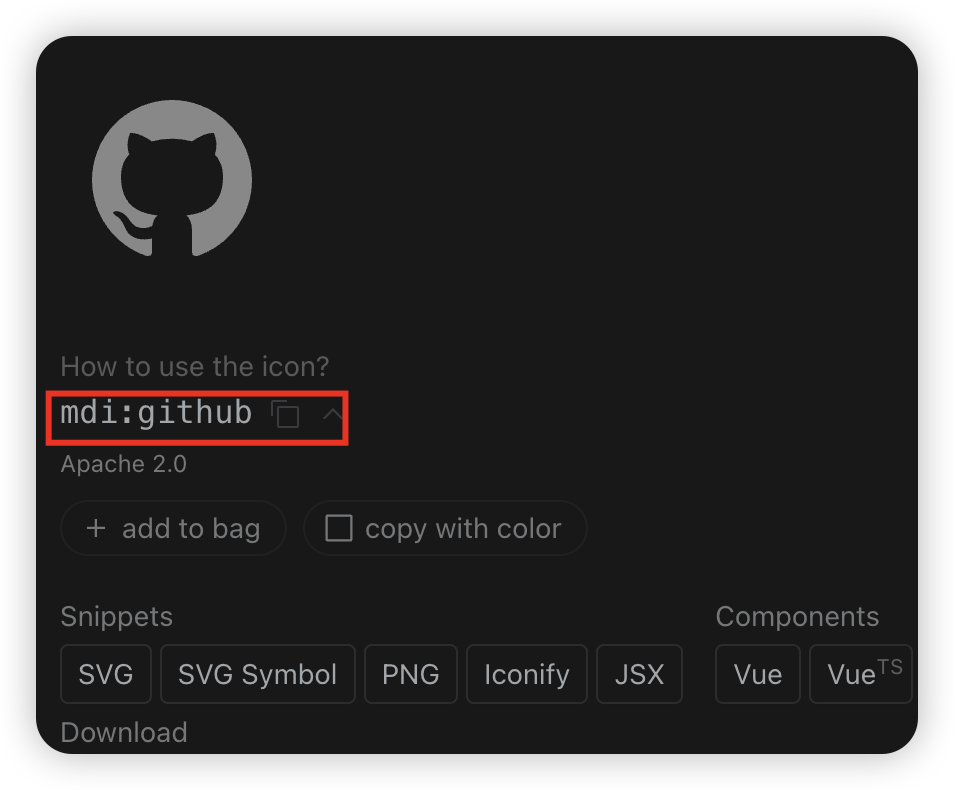
- Use the
IconifyIconcomponent in your component and passmdi:githubto theiconprop, like this:
import IconifyIcon from '@/components/Icon/IconifyIcon';

export default () => {
  return <IconifyIcon icon="mdi:github" />;
};
The IconifyIcon here is a custom component, which you can find in src/components/Icon/IconifyIcon.tsx.
The icones icon set shown above is just one of the icon sets supported by Iconify Icon. For more usage details about Iconify Icon, please refer to Iconify
Svg Icons
Svg Icons is a common way to use icons, typically by placing svg icon files in the assets/icons directory and then using the SvgIcon component in your components by passing the svg icon filename to the icon prop, like this:
import SvgIcon from '@/components/Icon/SvgIcon';

export default () => {
  return <SvgIcon icon="github" />;
};
The SvgIcon here is a custom component, which you can find in src/components/Icon/SvgIcon.tsx.